Rogers is Canada’s largest telecommunications company and the head office is situated in Toronto. I was brought onto the UX team to help improve in-house call centre and customer dashboard software.
The notes widget project is part of a huge redesign on how the call centre staff interact with software. Wireframes and designs had been created over 2 years but the funding for the project fell through. I was tasked with revisiting the project and creating new UI through an end to end UX process. Rogers UX process was tailored differently for each project, I loosely used the 5D (Discover, Define, Design, Develop and Deploy) process as a checklist to get things in the right direction.
The call centre staff deal with different types of software when on a call with a customer. As part of that process the staff note down key facts about each call. These facts are stored on software so managers can manage sales, advice and products to their customers. The note widget is a simple pop out window that allows users to quickly interact and start note taking.
Goals
“As a Rep, I would the ability to easily capture notes against an existing or new interaction by simple one-click options”
Planning
After the design lead had briefed me into the project, I spoke with the Project Owners to understand the scale of the project. From there, myself and the PO estimated a 2 month time period, factoring in the hard deadline of Q2 2020.
Research
A large piece of primary research had been carried out by UX Researchers in the 2 years prior to me starting the project. The UX Research team conducted an internal online survey for every team that interacts with the software.
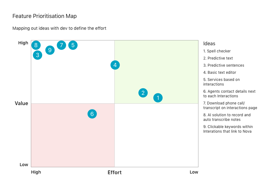
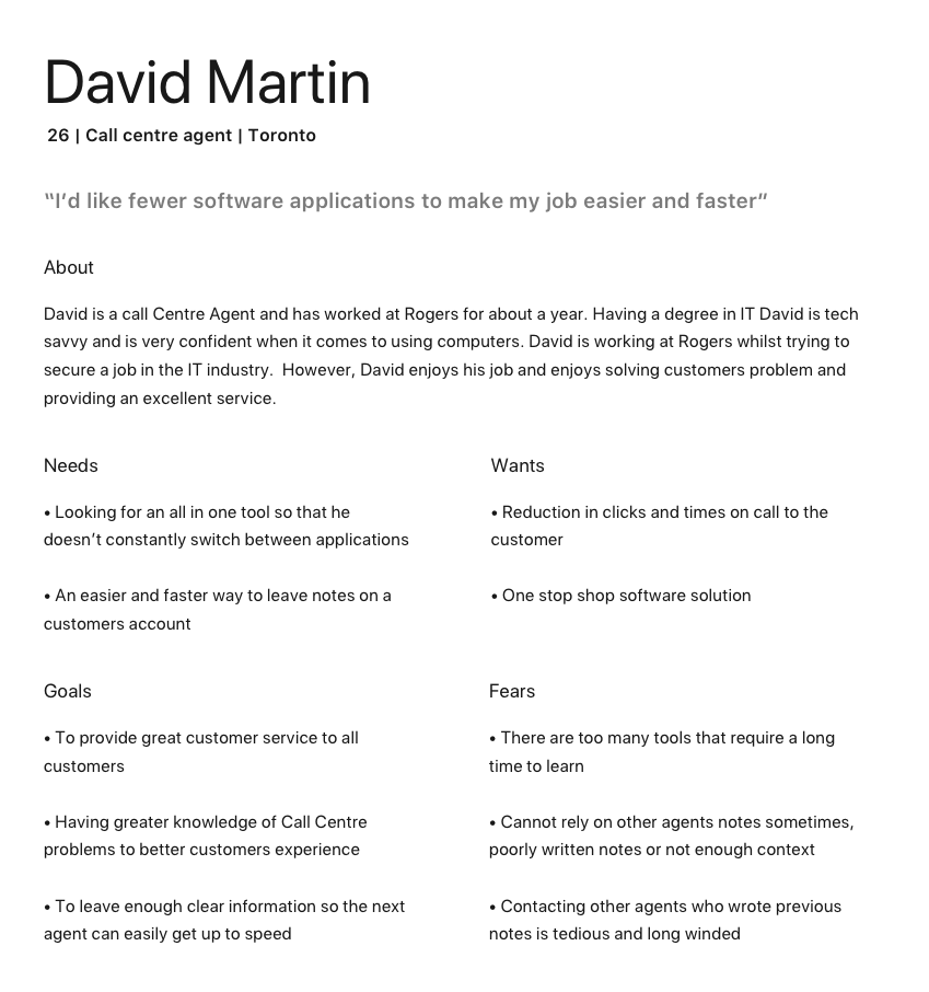
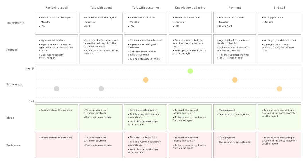
As part of the research phase I shadowed a Credit Operations Call Centre staff member for just over 3 hours and documented their processes and frustrations. From my notes and the prior research, I started to identify trends in problems and document them to inform the design phase.
Design & Test
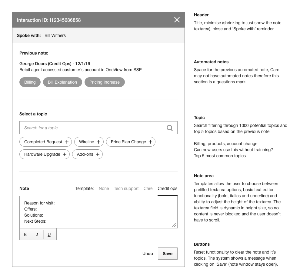
Due to a tight time deadline only wireframes were needed in this particular project. I brought together all of the insights/sketches I had and started creating wireframes in Sketch. These wireframes went through multiple rounds of feedback within UX Design team and the Project Owners.
Design system
Whilst working at Rogers I had the opportunity to be part of the new design system that was being implemented. Prior to the design system everything was uploaded to Sketch Cloud, however, with lots of limitations and version control being painful we looked into other ways software could help us. We conducted multiple test runs with Abstract with different teams using it, we started publishing all design files onto the software.
My team and I decided, after many meetings and white board sessions that we would take an Atomic Design methodology, essentially breaking down core design components into Atoms, Molecules, Organisms and pages.
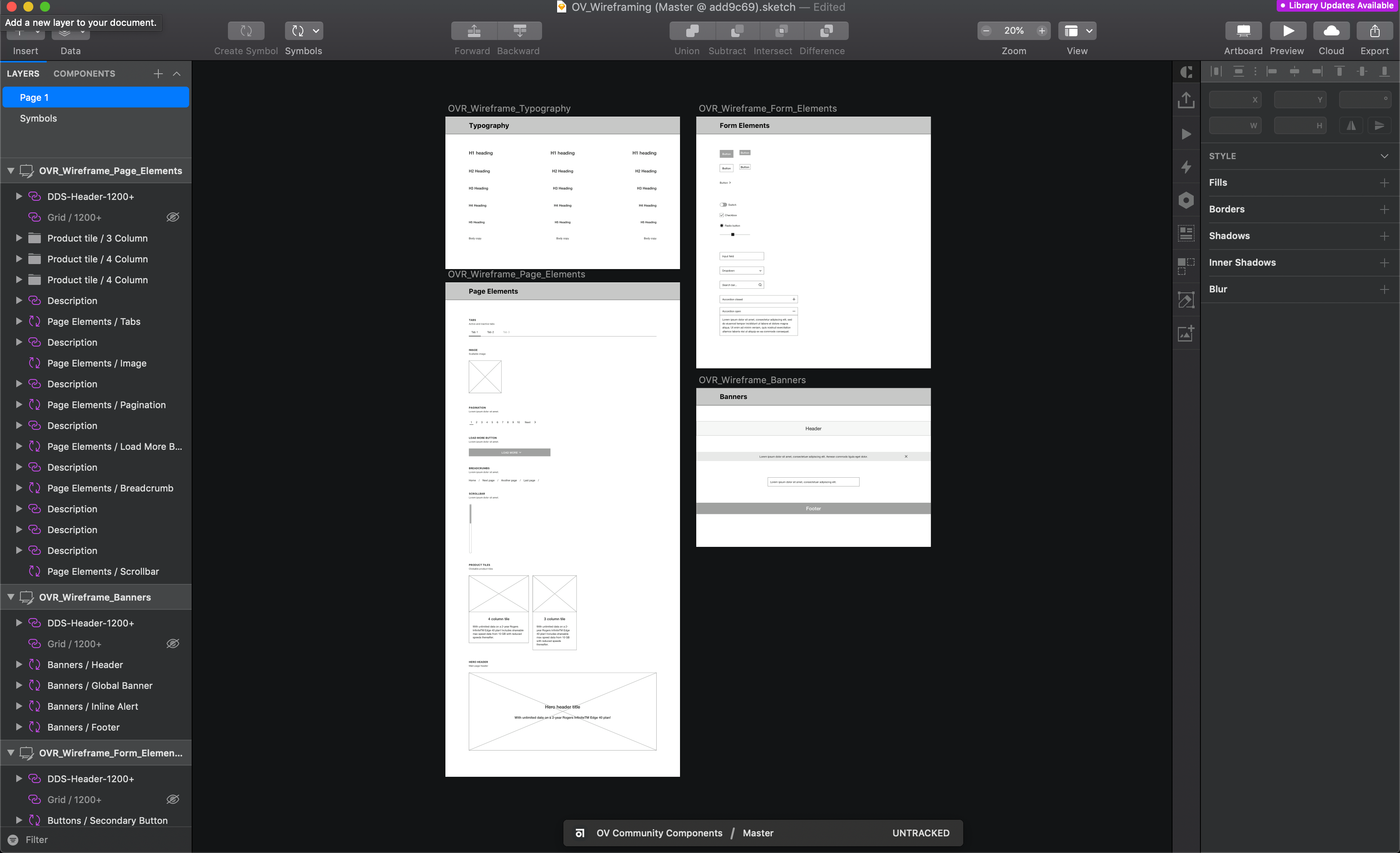
To speed up work flow I created a wireframe design system for designs to rapidly prototype ideas in sketch. Once a designer had login credentials, the process was easy: download the necessary folder, create a branch from the master, work on your file and then merge with the master document (much like GitHub). I used it in this particular project and it’s still being used today by designers at the company.
The outcome
After a few rounds of feedback the wireframes were due to be sent to a UI designer. Through the UX process I discovered some problems with development limitations. The initial code base for the Call Centre software was out dated and very difficult to change, this impacted some of the designs and best practises that we had to compromise.
I ended up creating a future state version of the wireframe (without tech limitations) for the UI designer to use later on in the project.
I believe this project benefitted the business by reducing time and frustrations the call centre staff experienced.