Tabcorp is a diversified gambling entertainment company employing more than 5000 people. It operates market-leading businesses and is the largest provider of lotteries, Keno, wagering and gaming products and services in Australia.
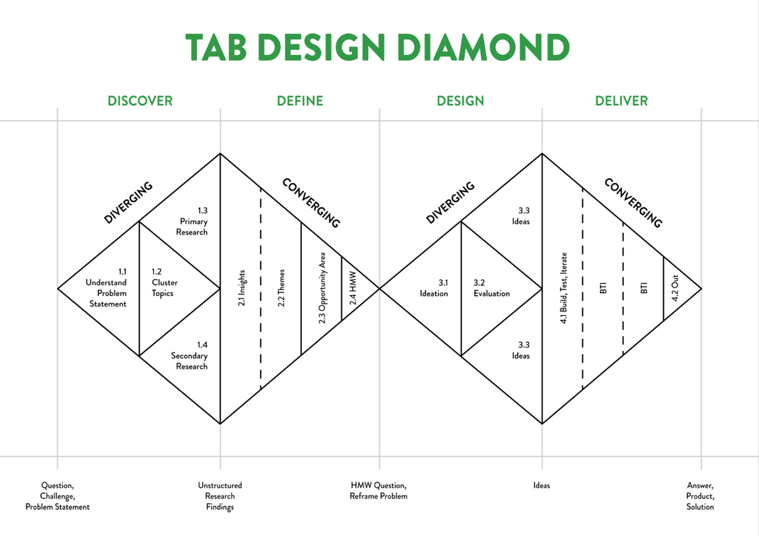
The Multiplier project was the first end to end project I worked on at Tabcorp. Unlike many other companies I’ve worked for, TAB’s UX process is set in stone and follows Google’s Double Diamond. During this project I paired with my colleague UX Designer (Scotsman and fellow tea lover) Guy Ligertwood and I worked as the UX Owner, the go to guy for all things Multiplier.
Other than following the Double Diamond process, I had to present my design thinking back to the business (normally in the form of a big Sketch document), regularly chat to developers (to see what was possible) and have weekly catch ups with the Wagering Product Managers.
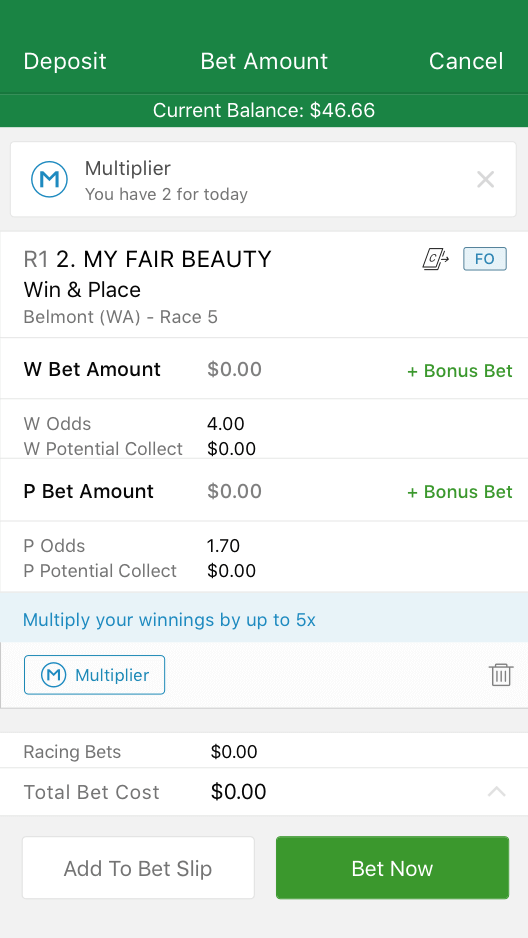
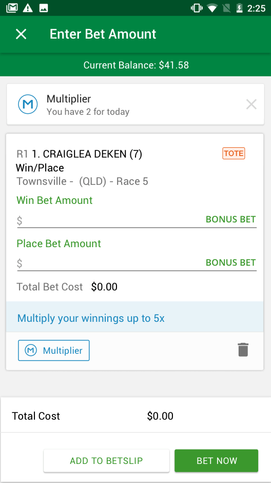
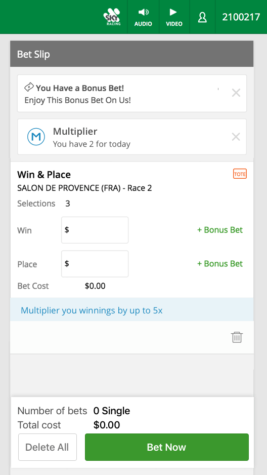
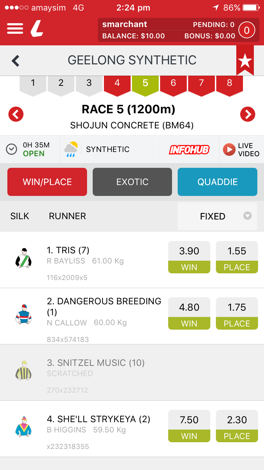
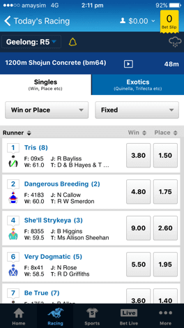
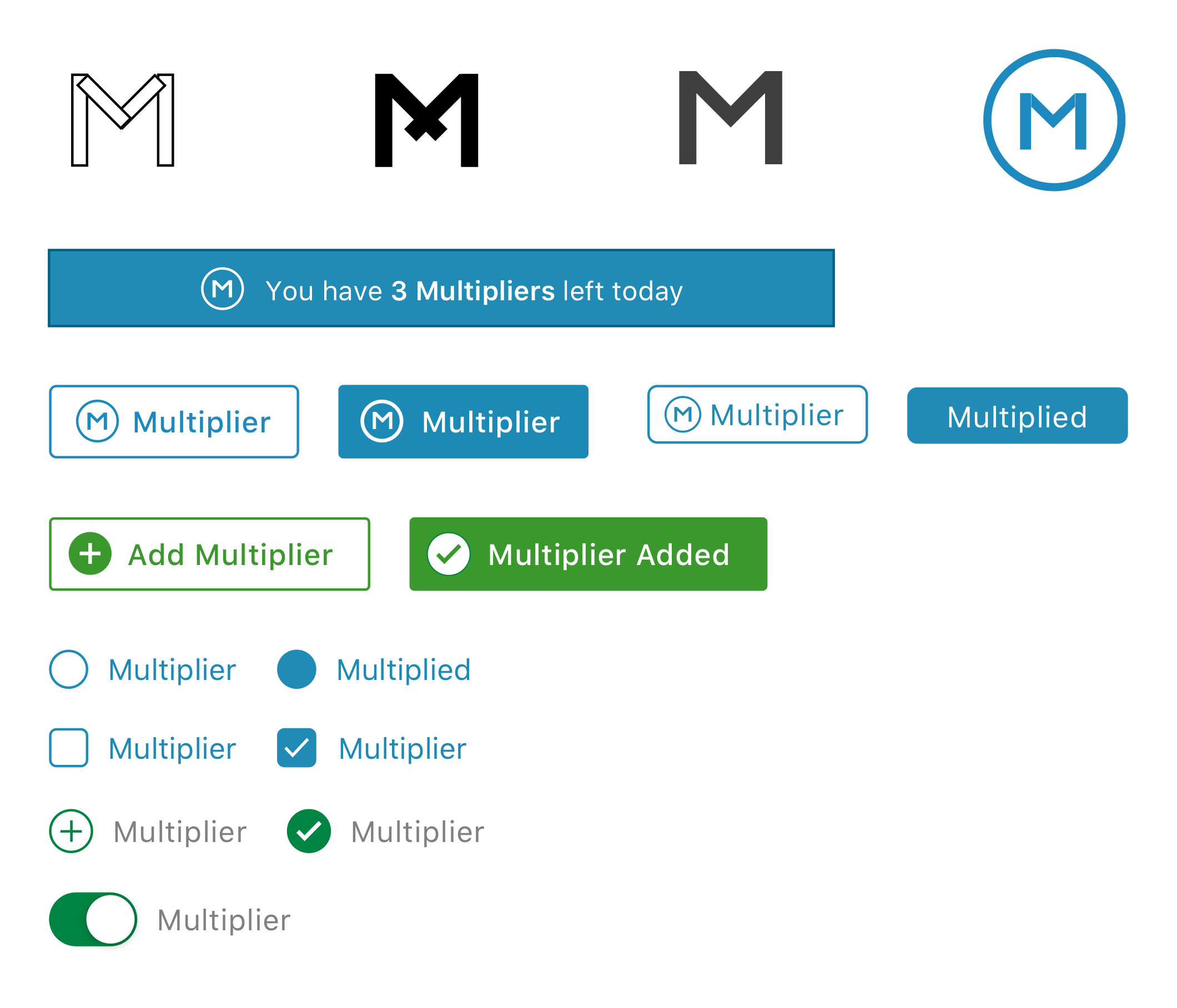
Multiplier is TAB’s version of an odds boost. With almost all of the major competitors offering an extra incentive to bet each day, TAB needed a way of keeping up and improving the overall betting experience.
The problem from the users perspective is that TAB don't give daily incentives, something that the competitors are good at and communicate it well.
From a business perspective TAB wanted to add excitement to the betting experience and wanted to address to steady decline of TOTE (pool betting) bets.
Goals
As for any project, the goals were broken down into both business and UX:
Planning
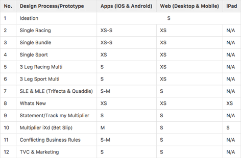
The first step of planning was to size the Multiplier project. Sizing is normally carried out by a few members of the UX team, using sizing cards and a detailed plan of what areas UX will be focusing on. With 2 dedicated UX designers, we estimated that the project would take 12 weeks to complete. The work was then split between each UX designer, documented and communicated back to the business. Once the wider business knew of the UX timeline then the developers could add in their sizing estimates.
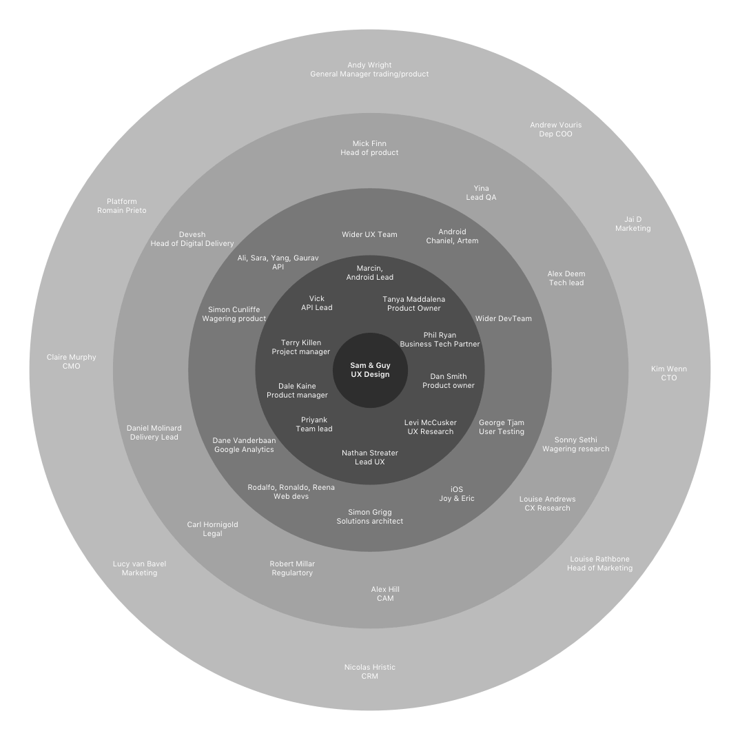
To bridge the gap between the UX team and different areas of the business, we created a stakeholder map. A stakeholder map lists everyone involved with the project and if they’re core, direct or indirectly related to the UX process. The document proved useful for when questions came up that only certain teams could answer (such as legal requirements). The stakeholder map also meant we could recycle most of the names for future projects.
Working with the head of customer research (Levi McCusker), a Kanban board was created. Having the Kanban on Trello gave the business transparency in what we were doing in terms of research. The Kanban was broken up into sections: icebox, What we don’t know (backlog), Next up, Doing, What we think we know (UX only) and What we know (Done and agreed with UX other areas of the business).
Research
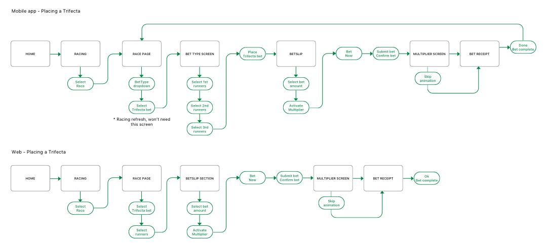
Guy and I decided that we would create a few different user journeys to highlight any potential pitfalls early on in the process. Although the process was helpful, it was time consuming and didn’t uncover any problems areas:
As part of the competitor analysis the focus was around 3 main competitors: William Hill, Ladbrokes and SportsBet. Particular attention was given to not only the experience but the animations/micro interactions also.
After creating the Kanban a few questions came up that warranted a workshop, the workshop was held over a couple hours one evening with 8 participants, split into 4 groups with a UX facilitator on each team. After running through a quick Powerpoint presentation we asked each of the participants a series of questions and noted down the answers on post-its. The workshop uncovered some interesting insights:
During half way through the research phase an issue had arisen amongst the business about displaying percentages versus decimal, so I worked with George Tjam (UX Researcher) to create a survey. The general consensus amongst the digital team was split but the survey results showed that users found percentages easier to understand.
Throughout the whole project Guy and I spent a lot of time talking with developers, constantly checking our design thinking and getting feedback. It really helped sitting on the same team as some of developers, just to make sure we were all on the same page. Guy and I found it a lot easier to communicate our designs through InVision prototypes, the developers could then check out how the app would work in there own time.
Design and test
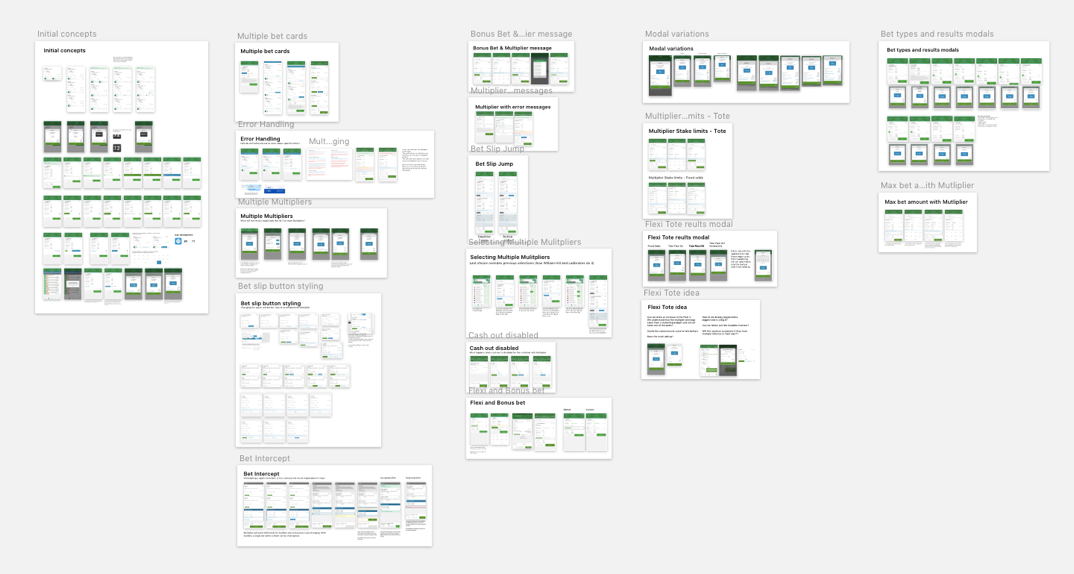
After speaking with different areas of the business and gaining as much research as possible, Guy and I decided to get the wider UX team involved. We started by explaining everything about the project, (limitations, pros, cons etc) then we ran a Crazy 8’s session. The session proved valuable and it was good to see what everyone had in mind for the project. After that session Guy and I went away and picked out the best ideas and explored them further.
At this stage of the project the UX team and the business had different opinions on how the Multiplier should work, so I went back to the business and documented this for reference later on.
The business really wanted to add excitement to the Multiplier through micro interactions and animations. The easiest way to get ideas for animations was to use Principle, it quickly turned our Sketch designs into full animations:
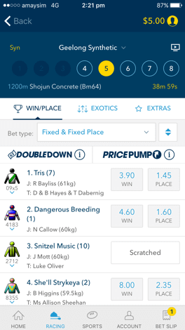
To communicate ideas quickly to the developers a big effort was made to create detailed prototypes using InVision for iOS, Android and web. The prototypes were sent to stakeholders, UX team and developers, that way everyone had clarity on the user flow. If we needed to change the designs at any point we would also update the prototypes.
The prototypes were also used to run real user tests. At Tabcorp we had a community of users who would participate in user testing sessions for credit on their TAB accounts. These sessions proved invaluable when commuting our design thinking back to the business. We made sure that everything was shown to the user, from the branding to the final written copy to document their thoughts and reactions.
Build
During the final stages of the design I pieced together all of the Multiplier designs and put them into a annotated document. The developers then used this (as well as the prototypes) to make sure what they were coding was correct. The developers inputted the finalised designs into Jira and used it as a ticketing system. Each piece of design (or update) was assigned to a developer and then the rest of the business could login to Jira and quickly check the overall progress of the project.
Although this system works well, we did have some issues when the business came back and decided to change some of the designs.
A few developers raised the design changes as an issue early on and suggested we started using InVision Inspect. InVision Inspect would have been better for both the business and developers but it was too little too late.
After the developers had the majority of the Multiplier coded and deployed onto test devices, we ran a bug bash. This essentially insured all of the design thinking and UX was working as it should be, it was also a good time to point out any elements that weren’t pixel perfect.
The bug bash proved very successful and only minor styling adjustments had to be made.
Product release
With such a big feature being released onto both iOS and Android, the business decided to stagger the release with the Multiplier only going to 10 high value customers first release. The next week we released to 1000 regular customers, ironing out any problems they may have had we finally released the feature to all of our customers.
The early signs was that everything was running very well and people understood the feature very quickly after having a go for the first time.
“Guy and I were super happy with what we delivered out into the wild. We were particularly proud of creating the consistency across the web and app team (which the digital team had struggled with in the past).”
Television communications
As part of the Multiplier project I got to work alongside the marketing team in putting together the television commercial. Never having done anything like this before, I had a meeting to go through what would be playing on screen and where I could provide assistance. Once a storyboard was in place, I sent across all of the animation files and detailed high resolution designs.
I ended up making 3 or 4 prototypes for the marketing team to show them how the Multiplier worked with the different bet types.
It was a great process to see something that you’ve worked not only come to life in retail stores, but on TV and also Australia wide.
The outcome
Before launching the Multiplier project, we created a page to pull Google Analytics insights. It quickly helped visualise how the Multiplier was doing and what devices users were using when placing a Multiplier. Having the Google Analytics page meant that we could send it over to stakeholders and give live updates to the rest of the business.
From early on in the project the business wanted to see a big up take in revenue, right from launch we saw increased bets and almost everyone using the Multiplier. As a rough guide we gathered the insights from last years data, compared with the Multiplier launch and the numbers looked great. We also received lots of great feedback from different areas of the business as well as forums and social media.
Before leaving Tabcorp, discussions were taking place for what lies ahead for Multiplier, general improvements and additional features were thought up by the business. For version two of the Multiplier the business wanted a more personal experience, offering up extra Multiplier for special events and birthdays etc.
During the project I learnt how to better communicate with fellow UX Designers and developers, I also learned to speak to everyone involved regularly and early on if there was an issue. It was also great to see the UX Double Diamond process complete from start to finish. I found enthusiasm for my work made others want to work with me and that the Multiplier project was a huge team effort. Overall I am super happy with the outcome and I’m glad that I got to work with such great people.